😢
you're leaving us?
We understand that things happen and situations change, but we hope you had a good experience with us!
Unfortunately, once a member leaves you can no longer reapply to join again down the road.
Are you sure you want to leave us?


Hi, Payton!
.svg)
Back
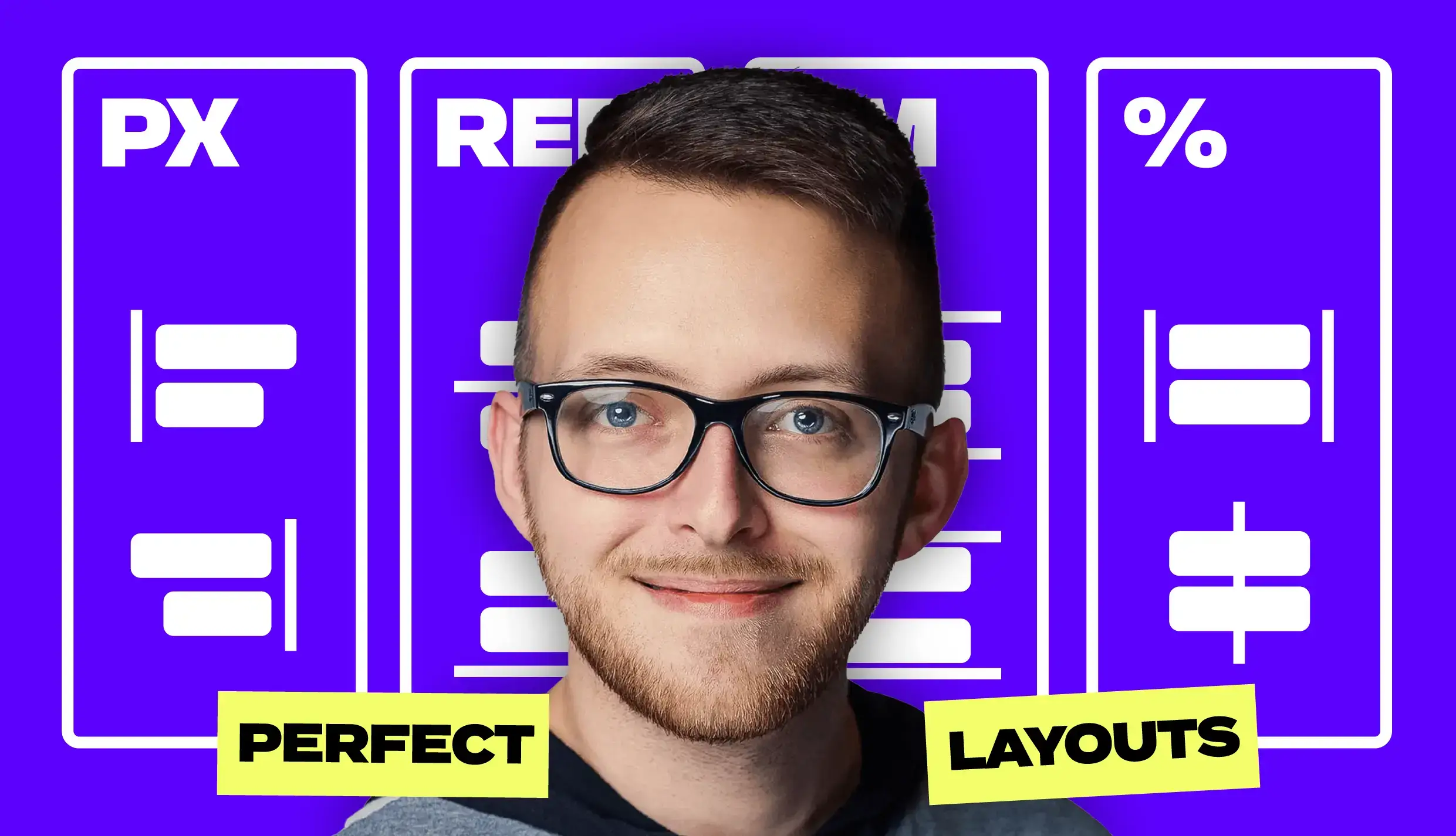
Wizardry: Website Layout and Responsiveness
Learn how to master website layout and responsiveness with Tim Rick.
Instructor:
Timothy Ricks
Length:
60:00
Category:
🎨 Design/Development
Live Training with Timothy Ricks on Website Responsiveness
Intro to Timothy Ricks
- Tim is a Webflow Developer, he’s created tools and visual builders to make more advanced features for Webflow more accessible
What we are going to cover:
- Units, where to use them and which to use
- Why do we want to do this?
- Set things up once and let it translate down into all your breakpoints
- Don’t have to make any extra changes for mobile responsiveness
- Goal: should be able to set up once on desktop and not have to make any adjustments
Font Sizes
PX
- If you set a font size to PX size, it will always be that size
- For accessibility, users need to be able to double their base font size, and with pixels you can’t do that
REM
- Works off of base font size of 16px (default of all browsers)
- Works for accessibility
- 1 REM = 1 * 16px
EM
- Similar to REM, but multiplies based off of nearest parent that has a font size applied
- Cases where we want to use EMs (video timestamp 22:27 minutes)
- Creating an animation of a heading sliding up and it’s being masked
- The bottom padding on the heading adjusts automatically based on the font size of the heading with EMs, where it doesn’t with REMs
- Letter spacing and max width
- When you adjust font, the max width and letter spacing scales based on font size of element
- Resizing components as a unit together on different breakpoints
Percent units
- One of the most powerful tools we have
- Watch an example of how to use % to keep aspect ratio of image across all breakpoints - video timestamp 29:30
- Video timestamp of Tim going through a working example to put together everything we’ve learned - 33 minutes
Viewport Units
- 50% Viewport width = 50% of viewport of browser
- Use sparingly because these units don’t respect user preferences or parent elements
- Better to use for min/max units for containing things
- Timestamp of Tim going through a full example - 40 minutes
Fluid Typography
- Can use fluid typography so the type shrinks to help with crowding, usually only needed on desktop
- Can use Fluid Calculator
- Best setting for accessibility is “disproportional” because it allows the user to zoom