😢
you're leaving us?
We understand that things happen and situations change, but we hope you had a good experience with us!
Unfortunately, once a member leaves you can no longer reapply to join again down the road.
Are you sure you want to leave us?


Hi, Payton!
.svg)
Back
Intro To Web Accessibility
Mirela teaches you everything you need to know to make your websites accessible.
Instructor:
Mirela Prifti
Length:
28:29
Category:
🎨 Design/Development
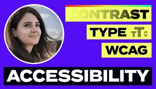
Intro to Web Accessibility
Meet your instructor: Mirela Prifti - web designer and advocate for web accessibility. This training will cover an intro to web accessibility that every designer should be aware of.
A Design-First Approach: Empathy
Empathy is a fundamental part of the design process. This means putting aside our own opinions and empathizing with our users to understand their needs. This should be an integral part of the design process.
WebAIM report
- Analyzed the accessibility of the top one million homepages for 2022
- WebAIM (Web Accessibility In Mind) - webaim.org
- Low contrast for text was one of the most common accessibility problems
Readability Contrast
- Readable text is easy to understand for most people, this is especially important for low vision users.
- Good readability also improves the user experience of a website.
- WCAG (Web Content Accessibility Guidelines)
- Provide guidelines and best practices for making web content accessible to everyone
- Recommend checking out their website to learn more about their initiative and guidelines
- Level A is the minimum level
- Level AA includes all Level A and AA requirements, many organizations strive to meet Level AA and this conformance level is generally accepted for most websites
- Level AAA includes all Level A, AA and AAA requirements
Text Elements
Text on a solid background
- WCAG minimal acceptable contrast ratio - needs to be at least 4.5:1 for regular text and 3:1 for large text (18.66px and bold or larger)
- Text contrast depends on multiple factors:
- Colors
- Text size - larger text size is preferred
- Font family - font with clear and distinct letter forms is easier to read
- Font weight - generally lighter weight fonts should not be used for smaller text sizes
- Font style - need to be mindful when using italic font style, not recommended for entire paragraphs
- Font variant - all caps can slow down reading speed speed for those with visual or cognitive impairment
- Line height - 150% is considered optimal line height
- Paragraph spacing - should be enough to clearly distinguish between paragraphs
- Letter spacing
- Word spacing - too much spacing between words can slow down reading speed
- Text alignment - left alignment is most suitable for left to right languages, center and right alignment should be used sparingly, full justification text alignment should be used sparingly on websites
Text on an image or shape background
- Interactive components and graphical elements that provide visual cues and information that enable us to interact with websites
- Readability should be at least 3:1 with respect to the background
- Adjacent colors on interactive elements:
- Toggle button should have contrast of at least 3:1 between the colors used to indicate toggling on and off
- Sliders: color blind people could have issues determining difference between sliders that are just colors. Adding additional elements (slider knob) to indicate the slider can be slid can help low vision users
Colors convey information
- Example: forms
- Primary element of a form is an input field
- Using different colors to highlight input field states
- Always test in light and dark mode
- However, not everyone can perceive differences between colors in the same way. It is necessary to supply additional hints when displaying errors. Links are another example of when color is not enough. Must use two visual cues for links - underline, color, font weight.
Headings
- Are important for accessibility because they provide structure, navigation and content clarity for users
- Also makes it more visually appealing and easier to digest by breaking up chunks of text
- Should be clearly distinguishable between each other
- Keep headings concise and descriptive
- Use clear and straightforward language
- Avoid using clickbait phrases
- Heading tags
- Provide logical hierarchy to pages and help those that use screen readers
- H1 - used for main title
- H2 - used for main section headings that represent subtopics under the H1 heading
- H3 - used for subheadings within the H2 headings
- H4, H5, H6 - used for further nesting and content organization. Less common than higher level headings, but can be helpful for organizing complicated content
- Can use headings map browser extension to test your headings
- Alt Text
- Help screen reader users or those with a slow internet connection
- Provides description of visual elements allowing people to better understand the content and context of images
- Should be descriptive enough clearly outline the purpose of the image and describing the content (subject matter, people, actions, and any other relevant detail)
- Should text alt text with assistive screen readers to ensure they work as intended
Accessibility statement
- This is a statement or commitment that states the level of conformance of the website to the WCAG Guidelines
- Can provide information on accessibility efforts that the company has taken to make the website accessible
- Also can provide clear instructions and contact information for feedback on the accessibility of the website and request assistance
- Template of an accessibility statement is uploaded as a resource for this training